
Digging Deeper on the MarTech 5k Supergraphic
Congrats to Scott Brinker and the folks at the Chief Marketing Technologist Blog for publishing the 2020 update to their famous "MarTech 5K Supergraphic."
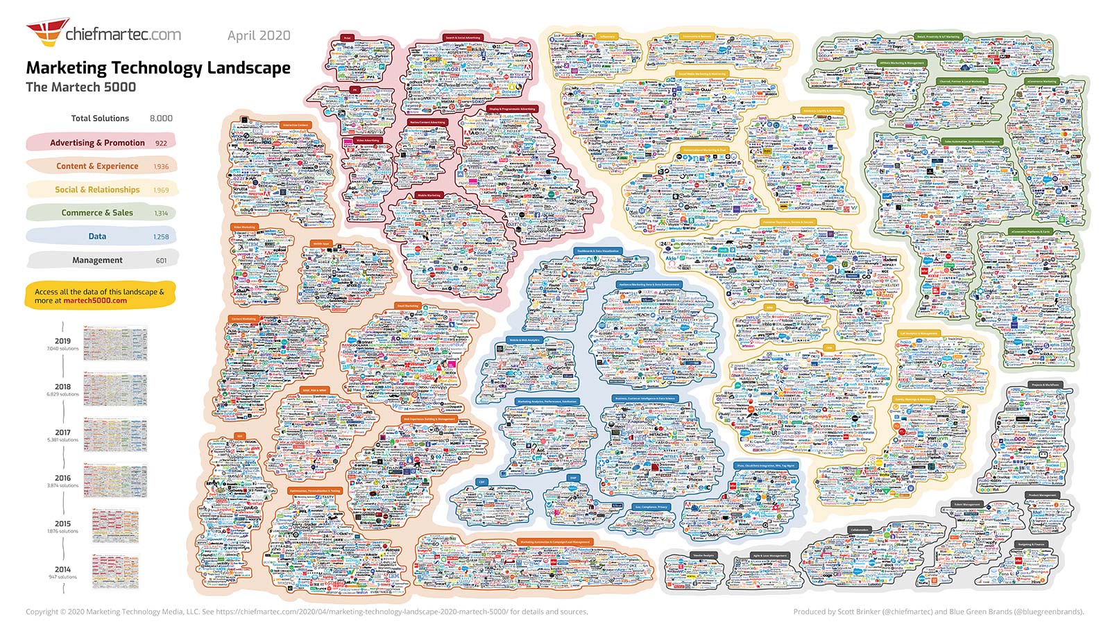
What an impressive (almost intimidating) achievement to plot more than 8000 vendors in a logical way. Some have questioned the value of this exercise...asking, what does this huge graphic tell us? I liked this reply on twitter.
It's kind of like a globe. You can't use a globe for driving directions, but it is good to see the world for what it is.
— Christopher S. Penn (@cspenn) April 23, 2020
What the supergraphic (purposefully) doesn't tell you is how to navigate the different regions of that globe.
How to Navigate
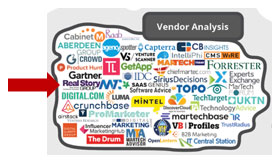
Obviously, with so many vendors competing for your business, discriminating clearly among them becomes essential. I'm happy that RSG is once again included in the "Vendor Analysis" category.
While we don't cover all 8000 vendors in this graphic, RSG's mission is to break down and analyze the strengths and weaknesses of 125+ of the most significant vendor options in seven of these MarTech segments. Want to see what this analysis looks like? Download a free vendor evaluation from any of these marketplaces.
Meanwhile, here are some "regional maps" to different marketplaces, with categorization to help guide you along the way.
Web Content & Experience Management
![]()
![]()
![]()
Customer Relationship Management
![]()
![]()
![]()
And, of course, if you want to see how we plot all of the vendors that we cover in one image, check out RSG's 2020 Omnichannel Technology Vendor Map. It's not a globe, but a first step towards interpreting your choices. When you're ready to take the second step, drop me a line.